Most of us can’t help but look around and see visuals every we go. We’re constantly bombarded by them as a matter of fact. Be it on a billboard, television or on social media, we probably don’t remember everything we see, maybe only the hard-hitting ones. As an advertiser or an agency that provides graphic design services with the best thing to do for your brand is to create visual content that leaves a lasting impact. And since billboards, magazine and television is slowly on the decline and social media rapidly on the incline, it’s wise to put some research and though while you create social media graphics designs so that grab people’s attention.
We’ve got tips and that’ll help you develop your style, increase your skill set and help you put out great work.
Let’s dig into 6 creative graphic design tips.
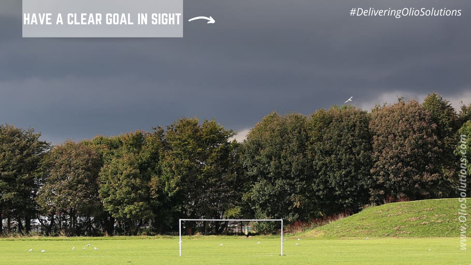
1. Have a clear goal in sight
Identify and find your goal first and then steer ahead. The most vital and important tip to bear in mind while creating graphic designs is to stick to your goal. Having a goal will not only help your design social media graphics better but will also but it will also allow you to tell your message visually. Start by asking yourself a few questions. While asking these questions keep in mind your target audience. Make it a ritual to always research your competitors and identify who your target audience. Once you know your who you want to target and the purpose of your post, you’ll have your goal right in front of you. While goals are important and that can never be understated, having too many can lead to a poor graphic design.
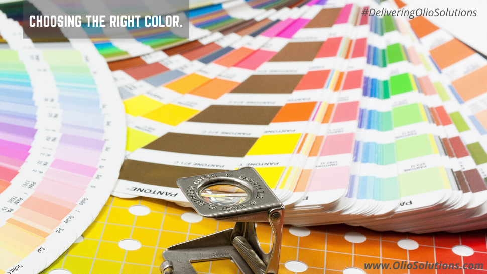
2. Choosing the right Color
Its rightly been said that colour is one of the most important elements of any form of design. It plays a role in setting the mood and atmosphere and is known to trigger past memories and emotions. Each colour and tone has a meaning of its own and a psyche behind it. Remember what your brand stands for or hopes to stand for and choose your colours depending on that. You ideally should fixate onto colors that reflect your brand, for instance you can do that by using only two to three main colors. Finding your color theme is crucial to the success of a design. Mc Donald’s for example chooses yellow as its primary colour. As the colour yellow is associated with happiness and family, it hopes to bring families together and enjoy a warm hearty quick meal. Another example is Nike choosing white and black for the tick, as by doing so the brand assures high quality standards and durability.
3. Setting the right Contrast
As discussed earlier colours play a vital role in the overall look and feel of graphic design. When the colors don’t contrast well enough, it seems to appear as if the colours are bleeding onto each other. Similarly, when the contrast is excessive it may lead to a visual vibration. Furthermore, colours also affect a person’s emotions and reactions to design. Thus we suggest you choose the right kind of color scheme that will bring out the desired reactions from your audience. A good rule of thumb to abide by is to always place a dark background behind if you have a light colored font and vice versa.
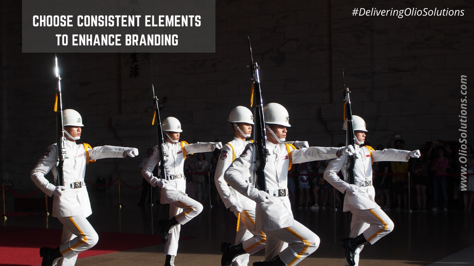
4. Choose Consistent Elements to Enhance Branding
If your social media content looks and feels consistent, your audience will see a pattern and form a clear understanding of your brands identify. However, if your content seems random, the audience may feel confused and not understand your brand or its message. Make sure all your content is consistent and in tandem with your brand. Ensure that you keep posting content in the same style, it can be difficult at times but being able to establish a strong brand identity will make it worth it.
An easy way to keep consistency is to create standard templates for quotes, announcements, promotions or sales. This will make it easy for you and your team to quickly create content.
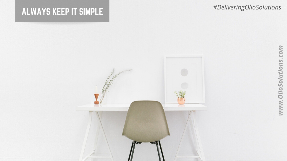
5. Always Keep it simple
The most universally agreed upon social media graphic design advice is to keep it as simple as possible. When working with small canvas such as mobile phones, overcrowding happens too fast. Its quite natural to get lost and carried away with so many great graphics and fonts out there to choose from. But, by reducing the unrequired clutter you are able to get your message across better. Ensure that each graphic design reflects and embeds the message you’re trying to tell.
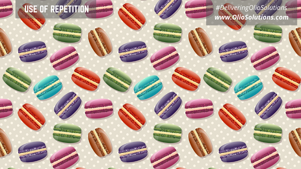
6. Use of Repetition
Always use the same set of fonts, colors, and logos as much as possible. One of the easier design elements to enhance your social media images is the principle or rule of repetition. Repetition is an important part of the process because it helps to establish and strengthen different elements. Three things to always try and be consistent with in your designs are fonts, colors, and logos. Over time, repetition of these 3 elements will give you or your brand a unique and instantly recognizable look. Repetition is also important when building a personal brand.
You have all the vital tips to create graphic designs that are, more engaging and target consumers on social media. If it all you feel like your falling short of some creative juice in you? We will inject some in you. Olio Services provides you with the best and the most relevant graphic designs for social media. We have an arsenal of creativity at our dispense waiting for you, that would successfully transform your brand.

